If you like old photographs this one’s for you.

fire

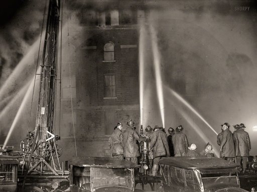
January 10, 1925. Washington, D.C. “Fire at S. Kanns warehouse, Eighth and D streets N.W.” National Photo Company Collection glass negative. Source: www.shorpy.com

A fascinating site. Lots and lots of interesting photographs. Of course they’re not all great photographs, but they do reflect the life of their period. Most are taken with large format cameras and the range of tones and overall sharpness is remarkable. It almost makes me feel like taking up large format photography.

Shorpy.com | History in HD is a vintage photo blog featuring thousands of high-definition images from the 1850s to 1950s. The site is named after Shorpy Higginbotham, a teenage coal miner who lived 100 years ago.

via Shorpy Historic Picture Archive | Vintage Photos & Fine Art Prints.

Photographs are also available for sale.

Interesting article on Elements and Principles of Design

An interesting read. I’m constantly trying to learn more about composition and design so this was definitely worth reading.

It’s probably not the first thing you think about when you’re going to make a picture.  But an awareness of the Elements and Principles of Design will help improve your work.  For some photographers, this article will be a review, for others, it will be new, but regardless, it will sharpen your photographic eye.The Elements and Principles of Design are the backbone of photography and indeed, for all the visual arts.  This article takes a fresh look at what the Elements and Principles of Design are and how they can be used to make your photographs better.

via Compelling Photographs: The Elements and Principles of Design – Luminous Landscape.

The Red List

An interesting site for browsing the work of a number of well-known photographers the Red List’s manifesto describes the site as follows:

With more than 100,000 images, 6,000 profiles and links, arranged into more than 600 sections and categories, the Red List organizes and concentrates the wealth of images to be found online. After all, what is a list if not a tool to manage infinity? So to manage the Internet’s visual infinity, the Red List is organized by genres – photography, cinema, fine art, fashion, and so on – with lists inside each genre to guide image researchers.

via The Red List.

The site has several sections, one of which is photography (the others are: Fine Arts; Film; Graphic Design; Furniture Design; Architecture; Set Design; Fashion; and Muses).

The photography section is organized (like all the other sections) by genre (17 genres in total including Pioneers; Architecture & Materials; Avant-gardism and Experimentation; Conceptual; Existentialism; Fashion; Humanism; Industrial; Landscape & Travel; Nude & Body; Outstanding; Pictorialism; Portrait; Social Documentary; Still Life; Street; War Reporting & Photojournalism. Each genre is sub-divided by photographer.

The site has a lot to see; is well-organized and attractively presented. However, the overall experience is marred by one very annoying feature: after a while a dialogue pops up asking you for your email address. If there is a way to dismiss this without entering an email address I’ve yet to find it.

Old (Pre Kodachrome) Color Photographs

Rule Britannia: Characters in a pageant – Britannia and her colonies and dependencies – on the grass in Southampton in 1928 – Source: Daily Mail Article – “1920s Britain at work and play: Glorious National Geographic colour photographs capture an innocent age a century ago” by Mark Duell, August 20 2015.

I was at the Metropolitan Museum in NY City a while back and saw my first autochromes there. I immediately fell in love with the delicate colors. Unfortunately I’m not willing to go to the trouble of covering glass plates with potato starch grains and so was unable to produce them myself. I tried to find a plugin or something that would emulate this look with a digital image, but so far I haven’t found anything I like. I was very pleased to come across these old images. They must have caused quite a stir when they were first produced.

From Boy Scouts on a hike to children playing on a beach, this wonderful set of photographs captures British life almost a century ago.

The images from the 1920s and 1930s also include scenes of postmen on their rounds, police directing buses and characters in a pageant.

They were taken by Clifton R. Adams, who was sent to England by National Geographic magazine to photograph life in the country.

Mr Adams, who died in 1934 aged just 44, had instructions to record its farms, towns and cities, and its residents at work and play.

He took the images in colour using Autochrome Lumière, which was the most advanced colour photographic process of the day.

The plates were covered in microscopic potato starch grains coloured red, green and blue-violet, with about four million per square inch.

Light passed through the colour filters when an image was taken, with the plate then processed to produce a positive transparency.

via Clifton R. Adams' photographs of 1920s and 30s Britain using Autochrome technology | Daily Mail Online.

Photo.net: Weekly Discussion 2.0 #1 – Bill Brandt – Baie des Anges, 1959

Source: Photograph In print and online, photograph magazine is your #1 source for photo-based photography exhibitions, events, news, reviews, profiles and resources.

Back in June of last year I posted about photo.net’s weekly discussions – each week focusing on a single image. I enjoyed this series but after a while it seemed to “peter out”. Now it seems it’s back as version 2.0 with the first discussion on the Bill Brandt image above. Let’s hope that it continues.

WEEKLY DISCUSSION 2.0 #1 – Bill Brandt

via WEEKLY DISCUSSION 2.0 #1 – Bill Brandt – Photo.net Casual Photo Conversations Forum.