2000th Post – Why I blog revisited.

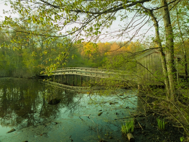
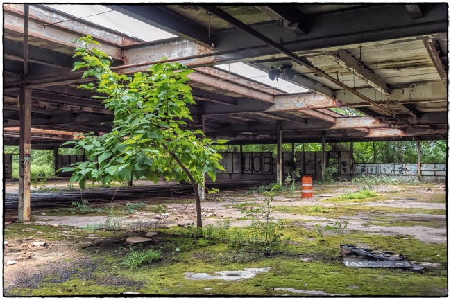
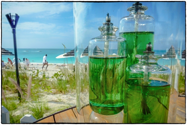
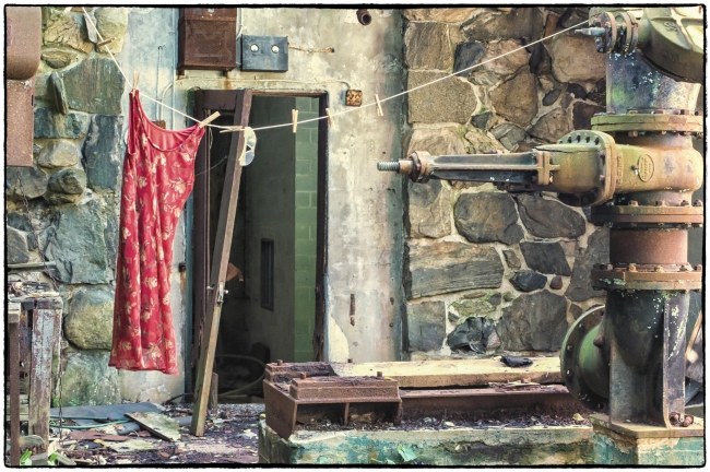
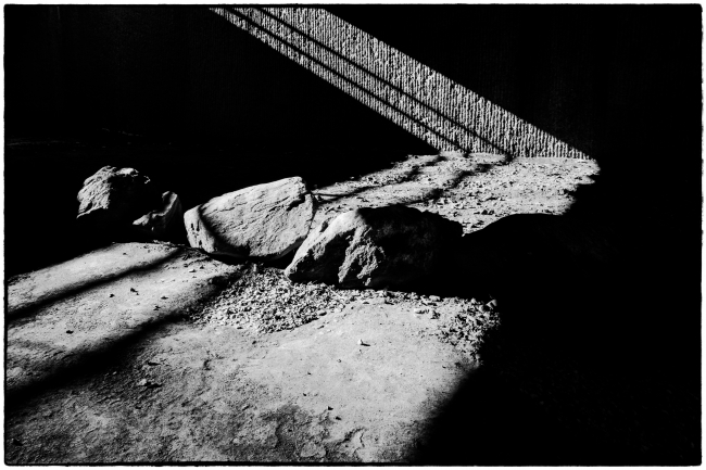
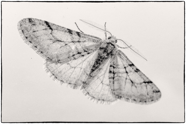
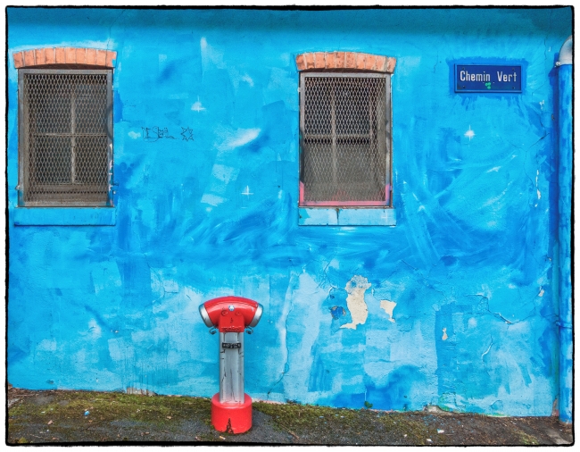
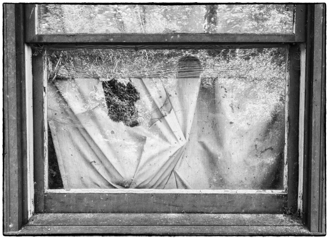
I started this blog in 2011, but didn’t continuously update it until after my retirement in April, 2012. This is the blog’s 2,000th post. Back in February 2015, I wrote a post entitled “Why do I blog?“. On the occasion of this 2000th post I thought I’d revisit it to see if it still holds true. I’m also illustrating it with a few favorite pictures (not necessarily the best, just some that I particularly like) added since I started the blog.

First – I originally started to blog to force me to get out and take pictures. All of my reading and advice from other photographers suggested that you have to do this in order to improve. I’m fundamentally quite lazy and tend to find excuses not to go and shoot. I thought that starting a blog would give me a reason to go and take pictures. So far it’s worked. I now take many more pictures than I did before and I can see a slight improvement over time.

I’ve done quite well on this. I take many more pictures than I did before. Sometimes I think I take too many and that “feeding the blog” takes precedence over taking better pictures. To partially offset this I’ve recently added some portfolios. Where the main part of the blog presents a wide selection of my photographs, the intent of the portfolios is to showcase the better pictures, no more than 20 in each portfolio.

Second – it provides me with a record of what I’m doing. It’s a bit like having a diary. I can look back and see where I was and what I was doing two years ago, for example. I’m a fan of mysteries and inevitably a police officer asks the suspect what he/she was doing on the night of such and such. I’ve often wondered how I would answer such a question since I can’t generally remember what I’ve being doing. With the blog I can just check the appropriate date and there’s a good chance that this will point me in the right direction.

This still holds. I like being able to look back on what I was doing (as documented by the photographs) at a particular time.

Third – Very few of my posts are thoughtful. They’re mostly just a picture and some text. Sometimes, however, I’m prompted to put some ideas forward and the blog is a useful vehicle for capturing them.

Still true. From time to time I have some thoughts I want to record, and the blog is a useful vehicle for doing so.

Fourth – The blog is a useful place to record links to things I’ve found on the internet that I found particularly interesting.

The blog continues to be a repository such items. It’s useful for me to have a single place where I can find them.

Fifth – The blog gives me the opportunity to combine two of my favorite pastimes: photography and history. I like nothing more that finding an old, interesting building; taking some pictures of it; then doing some research into its origins and history and combining the lot into a blog post.

I think this is what gives me the most pleasure. Perhaps I’m more interested in history illustrated with decent pictures than I am in taking great photographs?

In the introductory paragraph to the original post I noted: “The first point to be made is that I do it for myself. I imagine that I could get usage statistics, but I don’t bother to look…”. This continues to be true. I’m not interested in “likes” or “comments”. I someone bumps into the blog and finds something of interest then I’m happy, but I still do it for myself.

Croton Gorge – Why do they do this?

We’d walked some distance along the Old Croton Aqueduct (OCA) trail and decided to turn around and head back, this time staying on the OCA rather than taking the River Trail as we had going out. Soon afterwards I noticed the above on one of the rocks.

We continued down towards one of the periodic ventilators that you come across on the OCA and I thought to myself I’ll find some more graffiti on it and, sure enough, there was a lot:

On one of the buildings on the top of the dam I came across this:

I wonder why people feel the need to do this. I can understand that you might might be driving through some piece of urban blight and decided to stop, get out the can of spray paint and make your mark. But the OCA is little bit out of the way. You’d have to take the paint can with you, thinking I suppose that you might come across somewhere to spray it. Or maybe these people just carry a can with them at all times “just in case”.

Maybe they do it to express themselves artistically and I must say that I’ve seen some very impressive graffiti, obviously done by people with artistic talent. But this…it has no artistic merit. If the people doing envision themselves as future artists then they have a long way to go.

There is so much natural beauty in the Hudson Valley that it’s a shame that these morons feel the need to deface it. Why don’t they just go to one of the many decaying towns, find a wall somewhere and express themselves there. It would probably make the place look a bit brighter and in any case would most likely disappear when the building is torn down.

Apparently graffiti in the natural environment has increasingly become a problem. See this April, 2015 article in the LA Times: Graffiti artists’ move to national parks shocks nature community

Martin Parr on Photographic Clichés

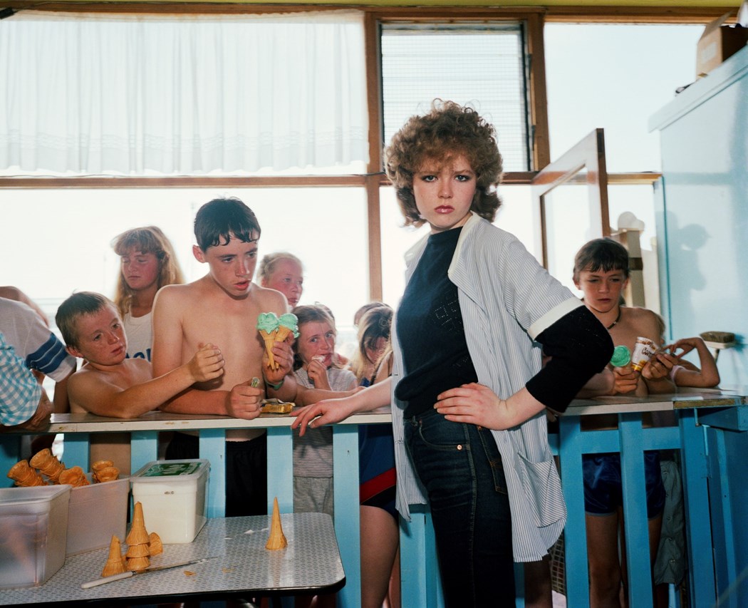
New Brighton. From ‘The Last Resort’. 1983-85 copyright Martin Parr / Magnum PhotosPhotography by Martin Parr

Thank you Martin Parr! This is a point that I too have made.

The Fine Art and Documentary photographers take great pride in thinking themselves superior to the other main genres of photography, such as the family snap shooter or the amateur photographer, as personified by camera club imagery. However, after 30/40 years of viewing our work, I have come to the conclusion that we too are fairly predictable in what we photograph.

Nowadays so many photographs are taken, in every conceivable genre that every subject has been ‘done to death’. Every subject is a cliché. My photographs are not terribly memorable because their subjects are clichés. They’re uninteresting because they’re not all that good. He goes on, with typical Parr humour, to provide a great list:

The above ground landscape with people; the bent lamppost; the personal diary; the nostalgic gaze; the quirky and visually strong setting; the street; the black and white grainy photo; the new rich; I am a poet; the modern typology; the staged photo; the formal portrait; the long landscape.

Source (for both quotes): Photographic Clichés | Martin Parr

The only thing I’d disagree with is his last paragraph:

But if we think of what is going on in our world, there seems to be many subjects which are avoided, because we all need that echo of familiarity to help us have the confidence to make a body of work. We want to emulate the impact that these images had on us, and this can be as restricting as it can be liberating.

Here he seems to imply that there are indeed subjects, which are not clichés and that you just have to look for them. I’m not convinced! To go back to his list – I don’t think there’s anything wrong with shooting black and white grainy photos, but if you do you have to be better than (or at least just as good as) Daido Moriyama. Again it’s not the subject, it’s the talent behind the picture. As in most fields very few photographers can be considered as truly great. The rest of us are just followers. Just don’t tell me that your pictures of people on the street are infinitely superior to that guys pictures of sunsets, just because his subjects are “clichés” and yours aren’t.

The Guardian has just done a piece on Parr to mark his winning:

…the outstanding contribution to photography prize at the 2017 Sony World Photography awards. Parr is being recognised for the impact he has had over more than 40 years both on photography as a medium, and on photographers. A special presentation of his work will be shown at Somerset House in London as part of the annual Sony World Photography Awards exhibition. See: Martin Parr’s outstanding contribution to photography – in pictures

A Blue Flag

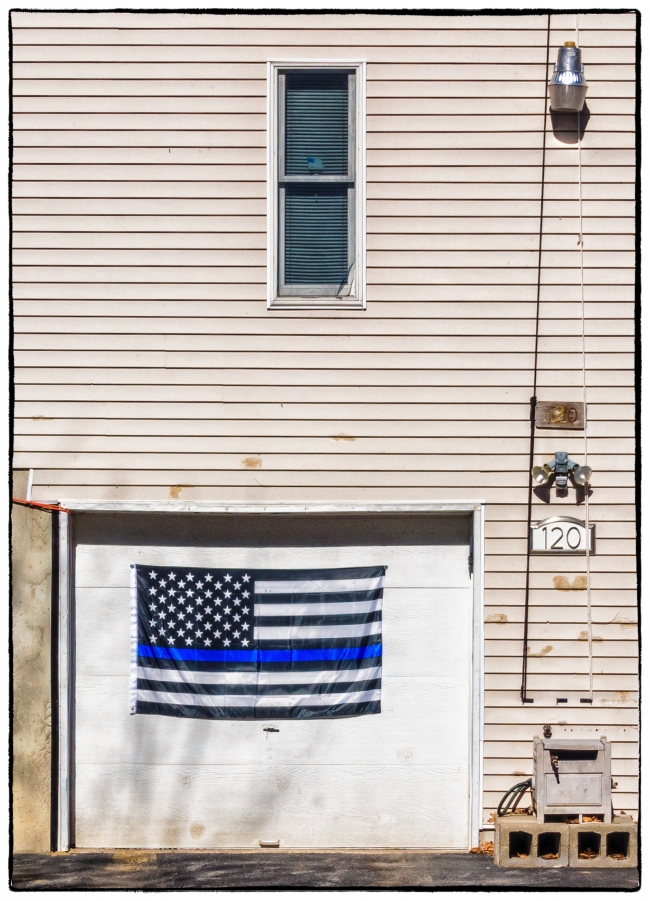
Today I came across this blue flag on the garage door of a nearby house. From the flags and signs around the house I’d earlier been able to infer that the owner was a) a Donald Trump supporter; and b) most likely a former serviceman (see Election 2016). This flag, however, was new and I’d never seen it before. I assumed that it had a specific significance so I took a few pictures and then returned home to look it up. Friends had told me that the owner was now a policeman, which makes perfect sense in light of what I was able to discover:

Apparently it represents “The Thin Blue Line” and it pays hommage to law enforcement officers and commemorates the fallen.

According to Wikipedia:

The Thin Blue Line is a symbol used by law enforcement, originating in the United Kingdom but now prevalent in the United States and Canada to commemorate fallen and to show support for the living law enforcement officers and to symbolize the relationship of law enforcement in the community as the protectors of fellow civilians from criminal elements. It is an analogy to the term Thin Red Line.

Union Jack variation of Thin Blue Line emblem. In the United Kingdom, the primary use of the badge is as a mark of respect for fallen police officers / staff. However, it also represents the thin line between order and chaos – this has become a large topic of interest in recent years, as severe cuts to government spending on public services has led to a dramatic decline in the number of police officers and staff in the UK. A variation of the emblem places a horizontal thin blue line across a Union Jack rendered in black and white. The sale of badges with this emblem is used to raise money for families of police officers that have died in the line of duty.

In the United States of America, each stripe on the emblem represents certain respective figures: the blue center line represents law enforcement, the top black stripe represents the public and the bottom represents the criminals. The idea behind the graphic is that law enforcement (the blue line) is what stands between the violence and victimization by criminals and the would-be victims of crime.

US flag based “Thin Blue Line”. Proponents of the symbol assert that the identifier is intended to show support for police. In the wake of the 2016 shooting of Dallas police officers, a US flag based version became popular among law enforcement personnel, their families and supporters.

Needless to say, there is some controversy surrounding this particular flag. It seems to relate to section 176 of the US Code dealing with “Respect for Flag” and which reads:

The flag should never have placed upon it, nor on any part of it, nor attached to it any mark, insignia, letter, word, figure, design, picture, or drawing of any nature.

Some maintain that this particular use is disrespectful, while others believe that it’s not a desecration of the American flag, because it’s a completely different flag. It’s a flag specifically to represent support for American law enforcement.

I think it might be wise to use the Thin Blue Line emblem (see below) rather than the flag. Although this too could be problematic. I’ve read (I don’t remember where) that in this emblem the blue line (which incidentally isn’t too ‘thin’ here) represents law enforcement standing between the criminals and the community. This is a fine idea, but then shouldn’t the line standing for the community be a different color. Having it the same color suggests that there’s no difference between the criminals and the community, which is clearly not desirable. If it were up to me I’d have a very thick white line representing the community, a thinner black line representing the criminals (there are probably more criminals that police but far fewer than the community as a whole) and a much thinner blue line between them representing law enforcement.

2017 World Press Awards Photo of the Year

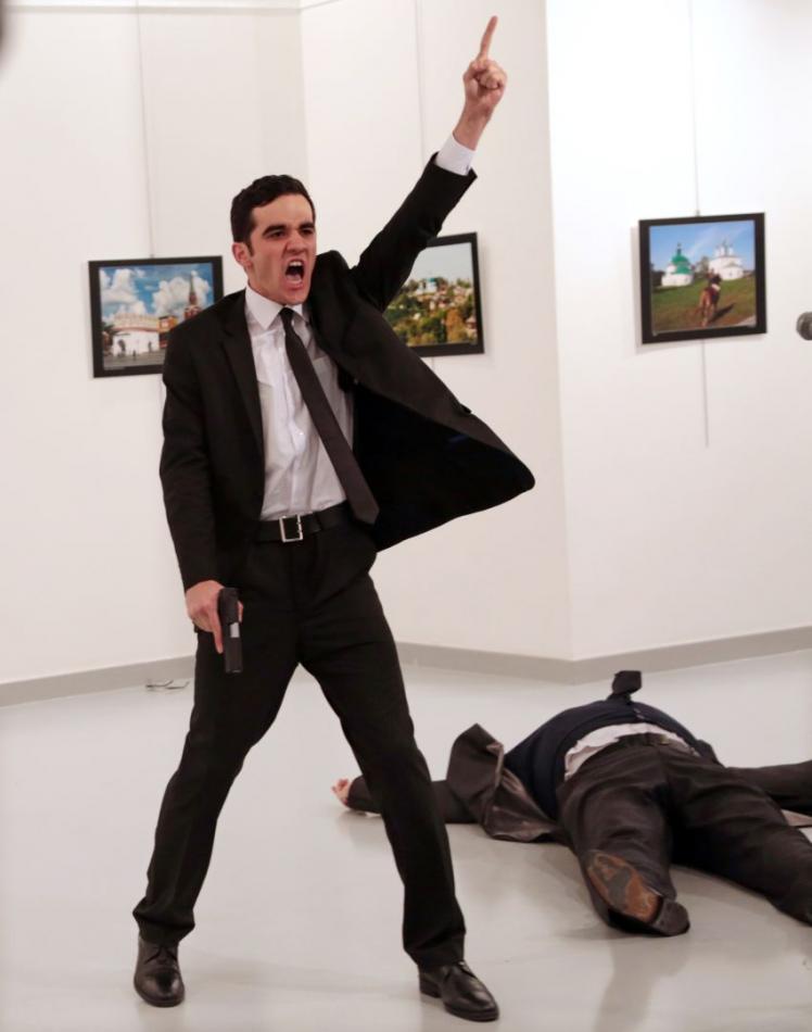
The photgraph below has just been named the Photo of the Year by the 2017 World Press Awards.

World Press Photo of the Year: Burhan. Source: 2017 Photo Contest | World Press Photo

For the NY Times’s take see: The World’s Best Photo?

While it’s certainly a very powerful picture and the photographer deserves considerable credit for maintaining his cool in an extremely dangerous situation, I not convinced that this deserves to take first prize. Certainly it deserves an award, but perhaps not first prize.

The photographer was already there, with his camera presumably at the ready. Yes, he could certainly have ‘done a runner’ (which is what I probably would have done), but he didn’t, remaining to get the shot. However, the story the picture tells is all too common: crazy person with gun kills someone. OK, in this case the victim was someone of significance, but the message remains. Unfortunately, it happens all the time (particularly in the US).

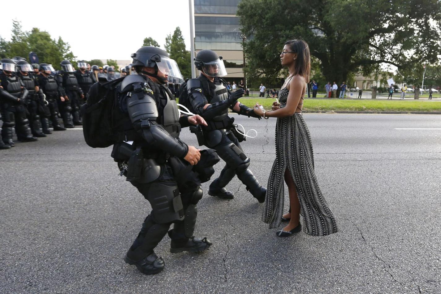
I much prefer the picture below, which to me tells a much more complex story of downtrodden people; over militarized police; remaining calm in the face of pressure etc. Although we don’t know the end of the story here I like to think that it’s a positive one, whereas in the picture above it’s overwhelmingly negative.

Taking a Stand in Baton Rouge by Jonathan Bachmann. Source: 2017 Photo Contest | World Press Photo

To conclude I find that I must take exception to the New York Times headline: “The World’s Best Photo?” World’s best NEWS photo – maybe? There are, however, lots of genres other than news: landscape; wildlife; portrait; documentary; street etc. etc. I don’t think you can declare a photograph as ‘World’s Best’ unless you take them all into consideration, which the Times certainly does not attempt to do in this article.