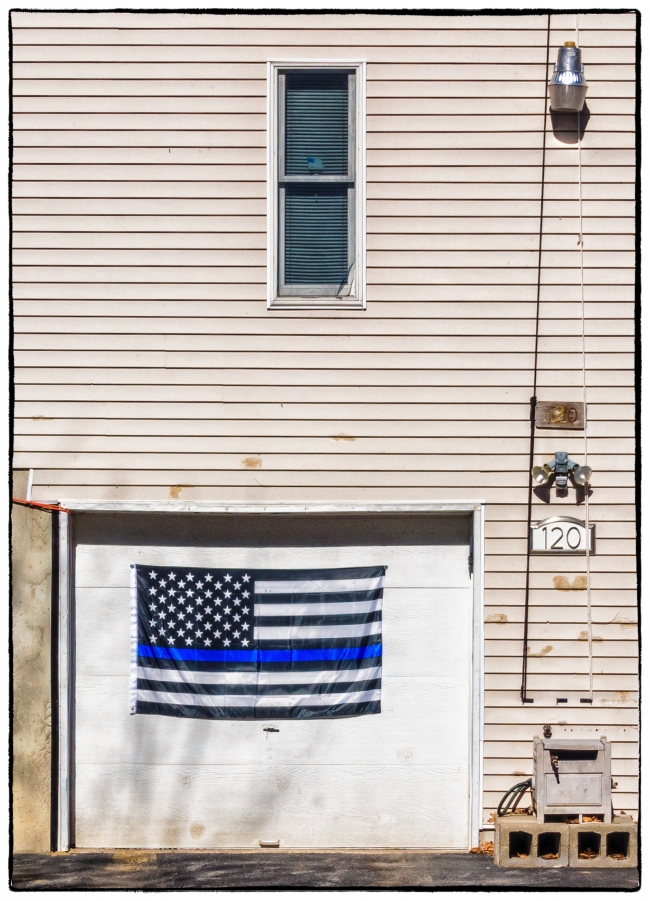
Today I came across this blue flag on the garage door of a nearby house. From the flags and signs around the house I’d earlier been able to infer that the owner was a) a Donald Trump supporter; and b) most likely a former serviceman (see Election 2016). This flag, however, was new and I’d never seen it before. I assumed that it had a specific significance so I took a few pictures and then returned home to look it up. Friends had told me that the owner was now a policeman, which makes perfect sense in light of what I was able to discover:
Apparently it represents “The Thin Blue Line” and it pays hommage to law enforcement officers and commemorates the fallen.
According to Wikipedia:
The Thin Blue Line is a symbol used by law enforcement, originating in the United Kingdom but now prevalent in the United States and Canada to commemorate fallen and to show support for the living law enforcement officers and to symbolize the relationship of law enforcement in the community as the protectors of fellow civilians from criminal elements. It is an analogy to the term Thin Red Line.
Union Jack variation of Thin Blue Line emblem. In the United Kingdom, the primary use of the badge is as a mark of respect for fallen police officers / staff. However, it also represents the thin line between order and chaos – this has become a large topic of interest in recent years, as severe cuts to government spending on public services has led to a dramatic decline in the number of police officers and staff in the UK. A variation of the emblem places a horizontal thin blue line across a Union Jack rendered in black and white. The sale of badges with this emblem is used to raise money for families of police officers that have died in the line of duty.
In the United States of America, each stripe on the emblem represents certain respective figures: the blue center line represents law enforcement, the top black stripe represents the public and the bottom represents the criminals. The idea behind the graphic is that law enforcement (the blue line) is what stands between the violence and victimization by criminals and the would-be victims of crime.
US flag based “Thin Blue Line”. Proponents of the symbol assert that the identifier is intended to show support for police. In the wake of the 2016 shooting of Dallas police officers, a US flag based version became popular among law enforcement personnel, their families and supporters.
Needless to say, there is some controversy surrounding this particular flag. It seems to relate to section 176 of the US Code dealing with “Respect for Flag” and which reads:
The flag should never have placed upon it, nor on any part of it, nor attached to it any mark, insignia, letter, word, figure, design, picture, or drawing of any nature.
Some maintain that this particular use is disrespectful, while others believe that it’s not a desecration of the American flag, because it’s a completely different flag. It’s a flag specifically to represent support for American law enforcement.
I think it might be wise to use the Thin Blue Line emblem (see below) rather than the flag. Although this too could be problematic. I’ve read (I don’t remember where) that in this emblem the blue line (which incidentally isn’t too ‘thin’ here) represents law enforcement standing between the criminals and the community. This is a fine idea, but then shouldn’t the line standing for the community be a different color. Having it the same color suggests that there’s no difference between the criminals and the community, which is clearly not desirable. If it were up to me I’d have a very thick white line representing the community, a thinner black line representing the criminals (there are probably more criminals that police but far fewer than the community as a whole) and a much thinner blue line between them representing law enforcement.


