Edward Steichen. A Life in Photography

J.P. Morgan photographed by Edward Steichen in 1903; photo known for the light reflected off the armrest being interpreted by viewers as a knife. Source: File:JP Morgan.jpg – Wikimedia Commons

This is another book I received as a birthday present. Unlike many of my of photography books this is less a book about Steichen than it is a book by Steichen. It’s full of interesting anecdotes and is lavishly illustrated with his photographs. The problem with such a book is that it’s hard to tell how objective it is. It’s clear from the book that he had a large ego. Does this get in the way of being honest about his work. I’m not sure how I feel about his pictures. While impressive, they somehow leave a me a little cold.

Pictorialist photographer; military documentary photographer; portrait photographer; fashion photographer; photography curator. Steichen is described in The Frustrating Genius of Edward Steichen by Frank Van Riper as follows:

In short, during his nearly 94-year life, Edward Steichen had not one but four, five, even six, separate careers. After the war for example, as director of photography at the Museum of Modern Art in New York, Steichen mounted what many have called the greatest photography exhibit of all time: the monumental “Family of Man” show, featuring 503 photographs from 273 photographers in 68 countries. (To be sure, the life-affirming show, mounted at the height of the cold war in 1955, was derided immediately by some critics as mawkish and superficial – and was savaged by some of Steichen’s younger photographic colleagues. It says something about the staying power of this exhibition, however, that its catalog not only remains in print, but also is a bestseller, after nearly a half century.)

I found myself wondering what would have happened if he’d had one overwhelming passion that he had devoted himself to. Would his pictures have had more emotional impact that they did spread over so many different areas? Of course we’ll never know.

Still – a great photographer and I thoroughly enjoyed the book.

My new workspace

Our basement is divided into a finished area (our TV room) and an unfinished area. A few years ago I started to use a portion of he unfinished area (used for our washer/dryer and as storage) as my workspace. Since then we’ve gradually tidied it up and made it more comfortable.

The latest change came about because we were cleaning up in the basement and I noticed a rattan shelving unit that he been used to store shoes. I asked my wife if I could have it. I’ve have photography books all of the house and I know that she was keen on me moving them into my work area. This shelving unit would be ideal. So we cleaned it up and moved it. It wouldn’t fit in the area as it then existed so I moved some of the furniture around and then moved all of my books. To make the area even more comfortable I decided to put pictures on the walls and on the doors of some cabinets we have down there. Here’s the new arrangement. I like it much more than I did before and consequently can see myself spending more time here.

Great quote from W. Eugene Smith

A farmer unloads his donkey in front of his home. His wife throws out the dirty dishwater. Extremadura. SPAIN. 1951. Copyright: Magnum Photos via Eric Kim: 7 Lessons W. Eugene Smith Has Taught Us About Street Photography

With all the fuss of late about digital manipulation of Steve McCurry’s pictures (for an insightful article on this topic see: Steve McCurry and photojournalism’s burden of truth on Disphotic) it was refreshing to come across this quote from W. Eugene Smith. Philippe Halsmann interviews Smith and at one point asks if a famous picture by Smith of a Spanish woman throwing water into the street (see above) was staged. Smith replied: “I would not have hesitated to ask her to throw the water. (I don’t object to staging if and only if I feel that it is an intensification of something that is absolutely authentic to the place). “Halsmann replies: “Cartier-Bresson never asks for this…. Why do you break this basic rule of candid photography?”. Smith’s response is brilliant:

I didn’t write the rules — why should I follow them? Since I put a great deal of time and research to know what I am about? I ask and arrange if I feel it is legitimate. The honesty lies in my — the photographer’s — ability to understand.

The rest of the interview is well worth reading.

Source: Discussing Honesty in Imagery – The New York Times

A Too-Perfect Picture

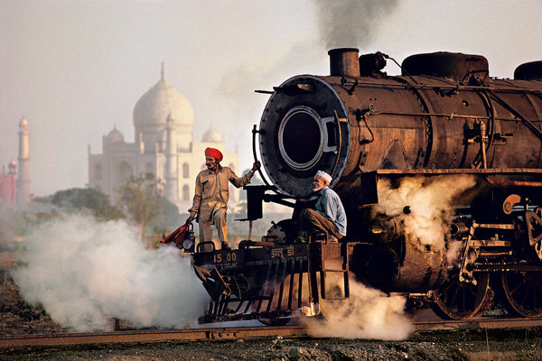
Taj Mahal and train in Agra, 1983. Credit Steve McCurry

In McCurry’s portraits, the subject looks directly at the camera, wide-eyed and usually marked by some peculiar­ity, like pale irises, face paint or a snake around the neck. And when he shoots a wider scene, the result feels like a certain ideal of photography: the rule of thirds, a neat counterpoise of foreground and background and an obvious point of primary interest, placed just so. Here’s an old-timer with a dyed beard. Here’s a doe-eyed child in a head scarf. The pictures are staged or shot to look as if they were. They are astonishingly boring.

I was quite angry when I first saw this article, but I’ve calmed down now and can perhaps be a bit more balanced. I’m not the world’s biggest fan of Steve McCurry. I find his pictures a little too oversaturated for my taste. However, to go after him the way the author of this article does is, I think, going too far. I come across this kind of attitude far too much: I don’t like his pictures all that much so I’m going to call them “astonishingly boring”.

Now I’m not at all sure that I like the pictures he prefers:

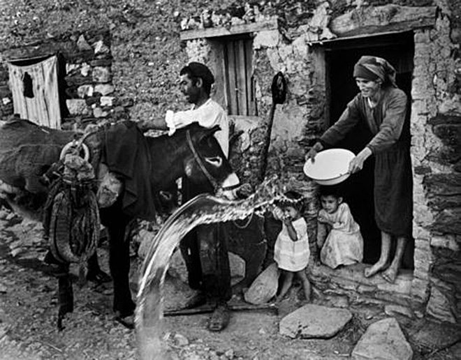
Kemps Corner, Mumbai, 1989. Credit Succession Raghubir Singh

I love even more a photograph Singh made in Mumbai a couple of years later. Taken in a busy shopping district called Kemps Corner, this photograph has less-obvious charms. The picture is divided into four vertical parts by the glass frontage of a leather-goods shop and its open glass door, and within this grid is a scatter of incident. The main figure, if we can call her that, is a woman past middle age who wears a red blouse and a dark floral skirt and carries a cloth bag on a string. She is seen in profile and looks tired. Beyond her and behind are various other walkers in the city, going about their serious business. An overpass cuts across the picture horizontally. The foreground, red with dust, is curiously open, a potential space for people not yet in the picture. The glass on the left is a display of handbags for sale, and the peculiar lighting of the bags indicates that Singh used flash in taking the shot. The image, unforgettable because it stretches compositional coherence nearly to its snapping point, reminds me of Degas’s painting “Place de la Concorde,” another picture in which easy, classically balanced composition is jettisoned for something more exciting and discomfiting and grounded.

But that’s OK. There are other famous photographers whose work doesn’t really appeal to me at this point. Maybe it will in the future – it wouldn’t be the first time e.g. at first I didn’t respond to Lee Friedlander‘s work, but after some study I now find that I like it. As the saying goes “Beauty is in the eye of the beholder”. You don’t have to like everything but please don’t denigrate things just because YOU don’t like them. By all means say you don’t like the work but why resort to “astonishingly boring”; “pictures staged”; “cliché”; “Weaker photography delivers a quick message — sweetness, pathos, humor — but fails to do more. But more is what we are” etc.

Of course he’s entitled to his opinion, but why the venom? I think the clue is in the paragraph:

How do we know when a photographer caters to life and not to some previous prejudice? One clue is when the picture evades compositional cliché. But there is also the question of what the photograph is for, what role it plays within the economic circulation of images. Some photographs, like Singh’s, are freer of the censorship of the market. Others are taken only to elicit particular conventional responses — images that masquerade as art but fully inhabit the vocabulary of advertising. As Justice Potter Stewart said when pressed to define hard-core pornography in 1964, “I know it when I see it.”

I think there are two points here: 1) Mr. McCurry is undoubtedly rich and famous and the author of the article clearly doesn’t like it; and 2) There’s something of the “real artists should be poor and living in a garret” line of thinking i.e. anything that makes money is bad. Edward Steichen had the same problem. I don’t subscribe to this view. Take Picasso for example. Definitely quite rich (his net worth at his death in 1973 was estimated to be around $50 million) yet few would dispute the artistic merit of his work.

Finally I also detect echoes of a familiar theme here: Social documentary photography has assumed immense significance and with it a sense that a photograph should always be some kind of “social statement”. This means that other genres are necessarily bad. Landscape photography – bad!; Flower photography – bad!; Wildlife photography – bad! I’ve said before that I don’t believe that Monet’s waterlilies make any kind of “social statement” (other than that Monet was well enough off to afford a big house in Giverny with extensive gardens and water features). Doesn’t stop his paintings from being art though. I guess this guy doesn’t like Weston‘s peppers or Adams‘ landscapes either.

Source: A Too-Perfect Picture – The New York Times

A couple of short videos

I came across these two short video interviews via Lomography. The first is with David Bailey and the second with David Hurn.


Preview image is from the Dazed video Truth, Beauty, Bailey.
Source: David Bailey’s Frank Thoughts on Photography and Beauty · Lomography

David Bailey seems to be somewhat rough around the edges and peppers his comments with expletives. You’ve got to admire his directness. I particularly liked this statement:

“I never understand when people say I don’t know what to photograph. Just look at a concrete wall with cracks in it and you can paint for eternity. I’m never at a loss to find out what to do next. It’s all there. All you have to do is open your eyes.”


Preview image of David Hurn is from the YouPic video Learn Photography.
Source: Photographic Tales and Lessons from David Hurn · Lomography

Hurn seems much more “refined”. I loved his story about the gun in the famous James Bond posters. And the statement at the very end. He’s holding a camera (I’m not sure what it is – maybe a digital fuji of some kind) and he says: “It’s a nice camera. It’s all I need – One little camera and a good lens…and good shoes.”