
Before I get into this post let me tell you a bit about me and my photography. I’ve been taking pictures for over 40 years, initially exclusively using film (there wasn’t anything else when I started). I’m something of a geek and working in IT for some time makes me comfortable with technology. So when digital photography came on the scene I was an early adopter. I had never collected anything until around 2011 when I decided to collect old film cameras, which I continue to do.
I enjoy the convenience of digital photography and I enjoy processing my images using Lightroom/Photoshop (something I never learned how to do with film photography). But I also enjoy the way film photography makes me slow down and think more about each individual photograph. I’m a fan of photobooks and like to see my images in print. I also print individual photographs, often to give to friends since I don’t have a lot of wall space on which to display them. I’m also into social media and like to share my pictures with friends and family. I’m English and my family is all over the world and social media is by far the easiest way to stay in touch with them.
In summary I like both digital and film photography and think both have their place. I write this to show that I don’t have a bias for or against either.
Which brings me to the subject of this post. There’s a guy whose blog I follow. He’s a long time professional photographer. He writes well and generally I enjoy his posts. He also has a YouTube channel that I also enjoy but somewhat less. Frankly it’s a little boring. He merely sits in front of a camera and talks for about 15 minutes. I don’t think he realizes that nowadays people expect a little more sophistication in the videos they watch.
Of late he has often tended to go off on rants of his own. The gist of these tirades seems to me to be as follows:
1. Film photography is superior to digital photography.
2. Because of their years of experience professional photographers are superior to amateurs
3. Real cameras are better than iphones.
4. If you don’t print you’re not a real photographer.
5. Instantly sharing posts in social media is bad.
6. “Excellence” in photography is getting lost in “good enough”.
7. You are likely to lose your digital photographs whereas prints have a much longer life.
Of course everyone is entitled to his/her own opinion, but I’m forced to conclude that what he’s really saying is that only professionals can call themselves photographers and although the rest of us may take photographs we should not call ourselves photographers. He seems to look down on people who just take pictures for fun and share them on social media. Of course for decades people have been taking snapshots. It’s just that because of the nature of film photography you couldn’t take as many pictures and sharing them was much more difficult).
Needless to say I don’t agree. So in response to the above points.
1. Film photography is superior to digital photography. I don’t believe one is superior to the other. They both have their place.
2. Because of their years of experience professional photographers are superior to amateurs. I would like to remind everyone that amateur originally meant “someone who does something for the love of it rather than for money”. Somehow the word has now come to mean “a person who is incompetent or inept at a particular activity. I’ve come across many “amateurs” whose work is better than some professionals. Moreover, I sometimes wonder if when someone says they have 40 years of experience they really mean that they have one year of experience 40 times.
3. Real cameras are better than iphones. I love cameras. I collect them and have all kinds: film; digital; point and shoot; professional; 35mm; medium format etc. I tend to use “real” cameras more than iphones, but have been known to use my iphone for mundane documentary pictures, for fast sharing, and when I didn’t have another camera with me. For example, I was once invited to a friend’s house. Her name was Germaine and she was already quite old at the time and was talking about leaving that particular house soon. So I decided I would take some pictures in and around her house as I souvenir for her. I then used the images to make her a photobook. The only camera I had with me was an iphone, and quite an old one (an iphone 5s, which came out in 2013) at that, but the photobook looked great and she really liked it.
4. If you don’t print you’re not a real photographer. I like to see my photographs in print, but I can understand why people don’t print: it’s hard to get it right (particularly if you want to print in color) and what do you do with the print once you have it. Unless you’re willing to go to more trouble framing it and putting on a wall you’ll probably end up putting it in an album, or in a box and forgetting about it.
5. Instantly sharing posts via social media is bad. If I’m reading him correctly he’s not so much against sharing on social media. It’s the sharing it straight away that gives him problems. He provides a recent example of someone taking a picture of him, posting it on social media and than showing it to him right away. His argument seems to be that he was there when the picture was taken and so doesn’t need to see it right away. I don’t see why this is such a problem. Maybe the person taking the picture (who I apparently can’t call a photographer) wants to know if you like the picture wants to know whether or not you like it so that he/she can try another if you don’t.
6. “Excellence” in photography is getting lost in “good enough”. I can see what he’s saying, but I think his views are seen through the lens of a professional (i.e. commercial photographer). He seems to do a lot of portrait and wedding photography so I’m sure he’s lost a lot of income because Uncle Joe with his limited photographic knowledge and high end digital camera can deliver images that, while nowhere near as good as a professional might make, are “good enough” and cost a fraction of what a professional would charge. They might even be better in some ways: more dynamic, more interesting, more spontaneous etc. Most of the professional wedding pictures I’ve seen are formulaic and not particularly interesting.
7. You are likely to lose your digital photographs whereas prints have a much longer life. I can backup thousands of digital images in a few hours. I can them take them off-site so they are protected from fires, theft etc. Try doing that with several hundred albums and associated negatives. Of course many (myself included) don’t take the trouble to make these backups, but that’s not a reason to criticize digital photography as a whole.
I’ve seen some of this gentleman’s work. He has a website, a blog, an Instagram presence, a YouTube channel, he’s an active Twitter user, and is also on Facebook. Clearly he’s comfortable with technology so I guess it’s just that he’s somewhat averse to digital photograph in general, phone cameras in particular and the whole digital environment which allows easy creation and distribution of large numbers of photographs. I can certainly relate to that.
Unfortunately this seems to translate into a rather supercilious attitude to those who don’t see things the way he does. It’s the “I’m a real photographer because I use real cameras, and print the results, sharing the prints circumspectly – you use an iphone, don’t print and share a lot of crap with all and sundry so you’re not even worthy of calling yourself a photographer” that I take exception too.
He seems like a nice guy: hard working and devoted to his art/craft; a concerned person involved with a number of worthy causes. His photographs are what I would expect from a professional photograph: competent but not particularly awe inspiring. Don’t get me wrong, he’s a much better photographer than I am, my photographs being mediocre at best. However, I collect photobooks by and about famous photographers and I believe I know a truly great photograph when I see it.
I just wish he would just cool it with the superior attitude. I could even live with this if he didn’t choose to push it down my throat at every opportunity. It makes me avoid his blog and his YouTube channel, which is a pity because I agree with much of what he’s and thoroughly enjoy many of his posts/videos.
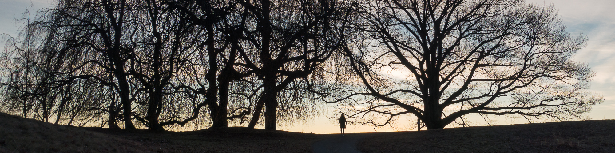
Taken with a Fuji X-E3 and Fuji XC 16-50mm f3.5-5.6 OSS II


