Another Freeman Patterson book: Photographing the World Around You

I already have one book by Freeman Patterson: Photography and the art of seeing. I enjoyed reading it so when I came across this one for sale (used) for a very reasonable price I decided to get it. Where my initial purchase focused very much on developing photographic vision this one focuses more on elements of design. It’s based on actual workshops conducted by Mr. Freeman who attempts to create a workshop in a book – not always successfully I felt. You just can’t create the feel of a workshop: the interaction with the faciliators; the interaction between the participants; the social aspects etc. in a linear print presentation.

The first sections explain the basic building blocks of visual design and how to put them together into a coherent whole. They were somewhat interesting, but I’d read similar material before and so didn’t find a lot that was new.

I enjoyed the third section on “Evaluating your Photographs”, which was really Mr. Freeman trying to explain how to do this by evaluating some of his own photographs. I didn’t always agree with the points he was trying to make.

The next section is on “Assignments”. Once again it’s Mr. Freeman discussing some assignments that he had set for himself in the following areas: people; natural things; human constructions and manufacturer things. It’s really about the importance of setting yourself assignments and not just randomly shooting.

The final (very short) section is about “Making an Album”. This, too, is carried over from Mr. Freeman’s workshops. It seems that on the final afternoon of each workshop the participants show their ten favorite photographs. Here it seems to be just another opportunity for Mr. Freeman to present some of his photographs – in this case eight rather than the ten the workshop would demand.

As with the earlier book I learned a few things; picked up a few ideas and enjoyed some of his anecdotes. However, I’m not sure that I learned enough to justify the purchase. Had I paid full price I would probably have been disappointed.

I also discovered that I don’t actually like his photographs all that much. They’re competent enough, but they don’t really engage me much emotionally. I don’t feel the desire to look at them over and over again the way I would with a Weston; a Strand; a Cartier-Bresson etc. I felt that I could, and have, made photographs similar to many of his. Maybe that’s the point: follow my advice and almost anyone, even you, can make pictures of a certain quality. That may be true, but for me at least I want to get past this point and make pictures that say something; that people want to look at. And I’m finding it extremely difficult to do so. I’m not sure that this book helps me much.

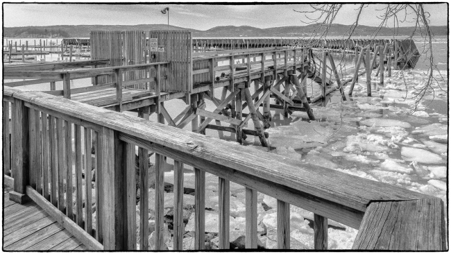
Wooden pier

Seen at Half Moon Bay in Croton-on-Hudson, NY. I liked the way this long, wooden pier zigzagged out into the Hudson. Also the textures of the wood. I find the branches to the top right of the picture distracting, but I couldn’t get this shot without including them and removing them in Photoshop was too much trouble.

Yellow flowers – an impression

In his book “Photography and the Art of Seeing“, author Freeman Patterson presents a series of exercises aimed at enabling creativity by forcing people out of their comfort zone. One of them is: “Shoot a sunset, a flower, and the surface of backlighted water, entirely out of focus”. In “Purple flower on a background of yellow” I posted a fairly conventional picture of an in-focus foreground element (in this case a flower) with an out of focus background.

However, bearing Mr. Freeman’s advice in mind I also took this picture where everything is out of focus. Both pictures were taken in a small area of unused land by the side of a busy road in Briarcliff Manor. Not a likely location for picture taking. I applied an ‘Autochrome‘ preset in post processing and enhanced the colors in Lightroom. I’ve liked autochromes since I saw some at the Metropolitan Museum of Art in New York City. I’m actually not too fond of this present, which to my mind doesn’t really provide the kind of luminous brightness that is typical of a true autochrome. In this case, however, it worked reasonably well and I like the result.

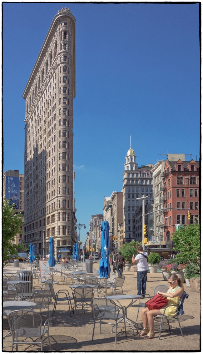
My take on the Flatiron Building

According to Wikipedia:

The Flatiron Building, originally the Fuller Building, is a triangular 22-story steel-framed landmarked building located at 175 Fifth Avenue in the borough of Manhattan, New York City, and is considered to be a groundbreaking skyscraper. Upon completion in 1902, it was one of the tallest buildings in the city at 20 floors high and one of only two skyscrapers north of 14th Street – the other being the Metropolitan Life Insurance Company Tower, one block east. The building sits on a triangular block formed by Fifth Avenue, Broadway, and East 22nd Street, with 23rd Street grazing the triangle’s northern (uptown) peak. As with numerous other wedge-shaped buildings, the name “Flatiron” derives from its resemblance to a cast-iron clothes iron.

The building, which has been called “[o]ne of the world’s most iconic skyscrapers and a quintessential symbol of New York City”, anchors the south (downtown) end of Madison Square and the north (uptown) end of the Ladies’ Mile Historic District. The neighborhood around it is called the Flatiron District after its signature building, which has become an icon of New York City.

The Flatiron Building was designated a New York City landmark in 1966, added to the National Register of Historic Places in 1979, and designated a National Historic Landmark in 1989.

It has been photographed by a number of famous photographers including Alfred Stieglitz (The Flatiron) and Edward Steichen (The Flatiron).

This is my take on it. Initially, as a kind of hommage to Steichen and Stieglitz, I thought to give the picture an old style “pictorial” look, but I didn’t like it. Then I tried a straight black and white conversion. Didn’t like that either so I decided to just leave it in its original color. If it works at all it seems to need the color. I think what’s happening is that the eye is drawn to the bright colors (the yellow dress and the red bag) to the bottom right of the picture. It them moves up through the photographer in the white shirt and follows the blue umbrellas to the base of the building from where you follow the vertical lines of the building upwards. At least that’s my story – and I’m sticking to it.