As you follow the ‘Benedict Arnold Escape Trail‘ from Route 9d you soon come across a small building with a number of metal panels on it. Over time these panels have weathered and formed the colorful shapes, which initially attracted me. I also liked the textures. I’m a sucker for rusting metal. Soon, however, I noticed that the colors of the panel seemed to reflect the colors of the autumn leaves that had fallen around the base of the panel. All in all the picture has something of an abstract quality.
Grasses
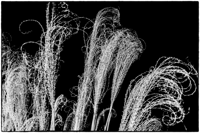
As the numerous commuters taking the Metro North Hudson Line pass the post office at Scarborough Station I imagine many of them don’t realize that the building that now houses the post office was once the railway station itself. Right outside the post office is a small flower bed, which at certain times of year has some very imposing, tall grasses.
One night in March, 2010 I was returning home from work when I noticed these grasses illuminated by a spotlight near the roof of the post office. This is the result.
Incense holders
Abstract
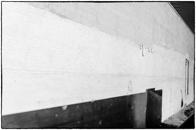
This was taken through the window of a travelling north along the Hudson River. Some of the reasons I like it:
1. The diagonal lines
2. The darker areas at the top and bottom
3. The almost abstract look
4. The ambiguity. It’s not immediately apparent what it is
I don’t like the lighter spots and blurred areas in the foreground, but I guess it’s inevitable considering the picture was taken through the window of a moving train..
A float
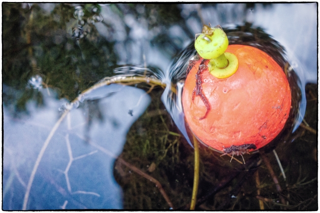
I came across this lonely float near a dock on one of our beaches. I liked the way the light area in the bottom left balances a similar area in to top right. And the way the darker area to the top left balances a similar area to the bottom right. Also the way the the curved twig seems to lead the eye to the float, which doesn’t really need this because of the extreme contrast between the bright colors of the float and the comparatively less saturated areas of the rest of the picture. It seemed to me that it would make an attractive almost abstract composition.


